Vibe code data visualization: Workflow, prompts and accuracy
How to vibe code a data visualization: Workflow, prompts and accuracy checks
Structured data and clear prompts help AI agents quickly generate working dashboards, but polished charts can easily hide miscalculated metrics or invalid timeframes. For teams and operators, effective vibe coding means guiding rapid visualization while maintaining strict control over data accuracy. This guide outlines a seven-step workflow, reusable prompts, verification checks, and release criteria using a synthetic B2B campaign example.
What does “vibe coding data visualization” mean?
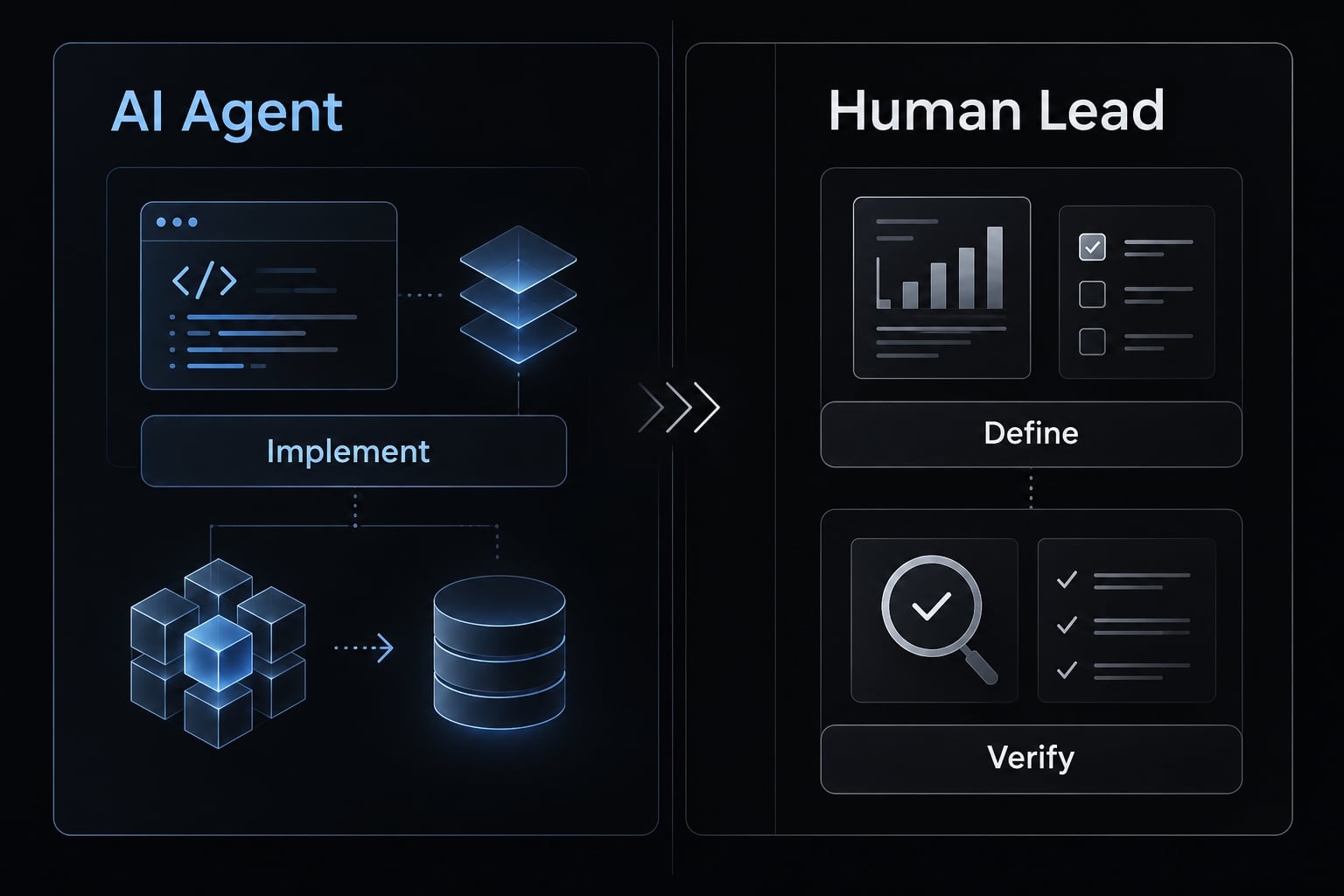
Vibe coding data visualization means using natural-language instructions to direct an AI coding agent that turns structured data into charts, dashboards, or interactive reports. The agent implements the requested application, while people remain responsible for defining metrics, checking calculations, evaluating visual choices, and deciding whether the result is safe to use.
This guide uses the term broadly for natural-language-led building, not the narrower practice of accepting generated software without inspecting its implementation. Natural language programming changes how instructions are expressed; it does not remove technical judgment.
What the AI coding agent handles
- Scaffolding an application or notebook for the intended output.
- Implementing approved transformations, charts, filters, and interactions.
- Running configured checks and revising code in response to findings.
File inspection, execution, and package installation depend on the agent’s permissions and environment. A proposed test is not an executed test.
What the human still has to decide
- Which decision matters, how metrics work, and which comparisons are valid.
- Whether the chart suits the question and supports an honest interpretation.
- What uncertainty is acceptable and who approves release.
This human-in-the-loop approach ensures direct human accountability at every critical decision point. Understanding the data remains necessary even when writing code is optional.
What can you build and which tool should you use?
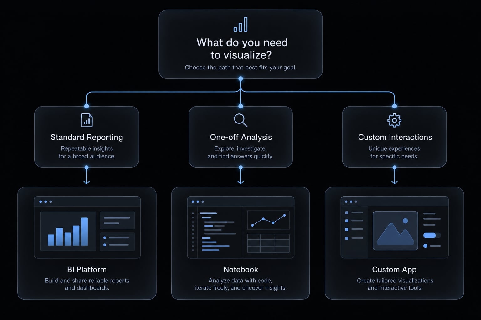
Choose data visualization tools by output, data sensitivity, interaction needs, and expected lifespan. Coding agents implement software; chart libraries supply visual components; application frameworks organize applications; business intelligence (BI) platforms provide reporting environments.
These categories complement one another. A chart library alone does not provide authentication, governance, or deployment.
Use-case and tool-selection matrix
Desired output | Suitable approach | Examples | Main consideration |
|---|---|---|---|
One-off campaign chart | Agent-assisted analysis | Claude Code + Python | Independently check totals |
Reproducible analytical report | Notebook or scripted report | Jupyter, ggplot2 | Preserve inputs and calculations |
Interactive campaign dashboard | Agent-assisted web application | GitHub Copilot + React | Own code and maintenance |
Standard pipeline reporting | Governed BI report | Power BI, Tableau | Reuse approved definitions |
Account geography map | Mapping component | Leaflet | Check geographic precision |
Product adoption explorer | Analytical application framework | Streamlit | Control filters and access |
Embedded customer chart | Web visualization library | Apache ECharts | Enforce customer isolation |
Scrolling data narrative | Custom visualization components | D3.js | Provide accessible alternatives |
The examples identify roles, not rankings. Official documentation for the selected agent, framework, and library should guide implementation against the versions actually installed. For reproducibility—the ability to repeat an analysis and obtain the same result—retain the dataset version, calculation rules, and environment details.
When vibe coding is not the best choice
- An existing BI workflow already answers the question reliably.
- Sensitive data cannot be processed under approved controls.
- The team cannot review or maintain the intended application.
A custom dashboard creates responsibilities as well as flexibility. Improving a trusted existing report may be more useful than generating a replacement.
A seven-step workflow to master vibe code data visualization
You don't need an engineering background to prototype dashboards, but you do need basic data literacy to verify the numbers. Higher-risk applications also need qualified analytical and engineering support.
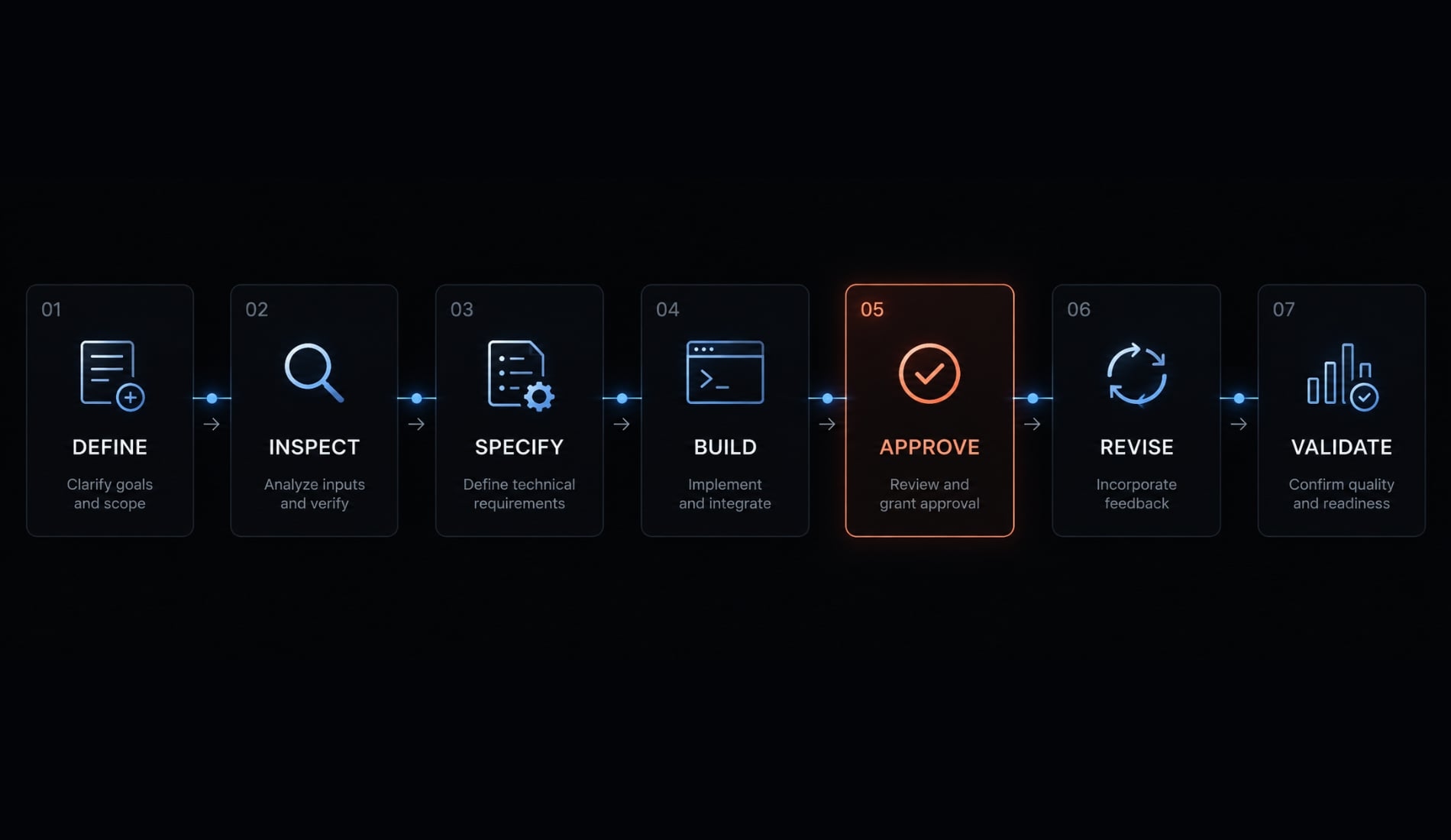
- Define the decision.
- Inspect the data.
- Specify the visualization.
- Approve the implementation plan.
- Build the smallest version.
- Make bounded revisions.
- Validate and classify the release.
The following illustrative example is not an executed build. It uses synthetic campaign-period summaries for a B2B software company; no tool run, screenshots, or observed errors are claimed.
Step 1 - Define the decision or user question
Identify the user, primary question, comparison period, and expected action.
- Weak request: “Build a marketing dashboard.”
- Stronger request: “Help the marketing operator compare January and February campaign cohorts and identify campaigns requiring investigation before budget changes.”
The primary question is whether conversion changed. Supporting questions concern campaign differences, sample sizes, and spend. Data visualization UX means making the decision easier, not merely improving appearance. The artifact is a short decision brief.
Completion check: The intended user can explain the action the dashboard supports.
Step 2 - Ask the agent to inspect the data before coding
Request: “Report schema, types, dates, identifiers, missing values, duplicates, units, and grain. Flag ambiguities; do not modify records.”
Record grain means what one row represents. Here, each row summarizes one campaign’s monthly cohort.
Period | Campaign | Channel | Spend, USD | MQLs | SQLs |
|---|---|---|---|---|---|
January | A | Search | 1,000 | 100 | 10 |
January | B | 200 | 10 | 9 | |
February | A | Search | 1,100 | 100 | 20 |
February | B | 200 | 10 | 5 |
MQLs are marketing-qualified leads; SQLs are sales-qualified leads from those same eligible cohorts, measured after equal 30-day windows. Counts are nonoverlapping between campaigns.
The schema contains period, campaign identifier, channel, approved spend, MQL count, and SQL count. Spend and counts are numeric.
Completion check: A person approves grain, units, eligibility, and source limitations. No silent deletion or imputation is allowed.
Step 3 - Write the visualization specification
Specify metrics, dimensions, filters, labels, interactions, and empty/error states. Define conversion as total eligible SQLs ÷ total eligible MQLs. Visual encoding means turning values into positions, lengths, colors, or sizes.
Consider:
- Grouped bars for campaign comparisons.
- A dot plot for a compact alternative.
- A table for exact counts and rates.
Require visible denominators, consistent percentage scales, keyboard access, and “not available” when the denominator is zero.
Completion check: Every chart maps to an approved question and calculation.
Step 4 - Ask the agent to plan before it writes code
Request a plan covering loading, transformations, chart components, library choice, filters, tests, and deployment assumptions.
Require explicit risks and unresolved questions. Separate calculation functions from presentation so reviewers can inspect metric logic. The artifact is an approved implementation and test plan - not generated code.
Completion check: The plan identifies known-answer tests and waits for approval before implementation.
Step 5 - Build the smallest functional version
Start with one approved source, one grouped chart, a period selector, and count tooltips. Exclude animations, generated commentary, and secondary views.
Keep edge-case fixtures separate from the baseline dataset. Include zero denominators, missing counts, and extreme values. Save a known-good version when January’s combined conversion matches 19 ÷ 110 ≈ 17.3%.
Completion check: The output answers the primary question and matches the independent expected value.
Step 6 - Iterate on the visual model and interaction loop
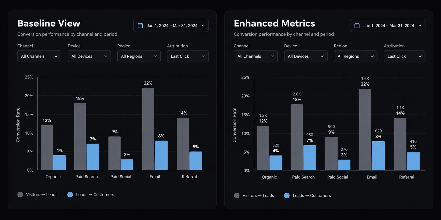
Make one bounded request at a time. For example: “Add denominator labels without changing calculations, filters, or scales.”
Constraint drift occurs when a later change breaks an earlier requirement. Hypothetically, adding labels might reset the selected period. Require changed-file summaries and relevant test results. This makes iterative development reviewable.
Completion check: The change works without breaking earlier acceptance criteria. Screenshots prove presentation, not arithmetic.
Step 7 - Validate, document, and decide how to release it
Independently calculate selected values. Test empty, malformed, duplicate, missing, and extreme inputs. Record source version, rules, dependencies, corrections, limitations, and actual tool/model identifiers and execution dates when available.
Classify the result as disposable visualization, internal prototype, persistent internal application, or public production application.
Completion check: Another reviewer can reproduce a value and understand remaining limits. Technical guardrails support this data science workflow; they do not guarantee correctness.
A reusable prompt template for better visualization results
Use this visualization prompt template after filling the placeholders. These are proposed prompts, not executed tests. Prompt restrictions need matching environment permissions and security controls.
Master visualization planning prompt
Plan a visualization before implementing it.USER AND DECISIONUser: [role].Primary question: [question].Decision supported: [action].Supporting questions: [up to three].SOURCE AND STRUCTUREApproved source/version: [file or table].Schema and types: [fields].Date range and timezone: [details].Units: [currency, counts, percentages].Record grain: [what one row represents].Known exclusions and freshness limits: [details].METRICSDefinitions: [approved formulas].Denominators and cohort eligibility: [rules].Reporting windows: [boundaries and observation periods].Aggregation, missing-value, duplicate, and zero-denominator rules:[approved handling; flag anything unspecified].OUTPUT AND INTERACTIONSDeliverable: [chart, report, or dashboard].Dimensions, filters, tooltips, and default state: [requirements].Loading, empty, and error states: [requirements].VISUAL AND ACCESSIBILITY REQUIREMENTSChart preferences, labels, axes, and units: [requirements].Include keyboard operation, visible focus, adequate contrast,non-color cues, and a readable data alternative.ENVIRONMENT AND RESTRICTIONSRuntime and existing project: [details].Permitted dependencies: [list].Sensitive-data restrictions: [approved processing boundaries].Do not upload data, install packages, or change records without approval.Non-negotiable constraints: [definitions and behavior to preserve].ACCEPTANCE CRITERIAKnown inputs and independently calculated expected outputs: [examples].Required interaction, edge-case, accessibility, and privacy checks:[list].Distinguish executed checks from proposed checks.First inspect the data and report ambiguities without changing it.Suggest up to three visual models and explain their trade-offs.Propose implementation and test plans, identifying risks and assumptions.Wait for approval before writing implementation code.
Prompt for a controlled visual revision
Change only [specified visual or interaction behavior].Preserve approved metrics, denominators, filters, and existing behavior.List modified files and explain each change.Rerun relevant acceptance criteria and regression checks.Report actual results, checks not executed, and unresolved regressions.Do not expand scope without approval.
Prompt for an independent accuracy review
Do not assume the implementation is correct.Trace [selected values] from approved source records to displayed results.Inspect filters, joins, dates, units, aggregation, and denominators.Compare against independently supplied expected answers.Provide evidence for each finding and distinguish tests executed fromtests merely proposed.Identify remaining uncertainty and items requiring human review.Do not certify correctness from the implementation’s own assertions.
Where vibe coding works well and where it commonly fails
AI assistance may shorten initial implementation. Checking calculations, refining interactions, and preparing for repeated use can still require substantial effort.
Tasks AI coding agents handle effectively
Useful tasks include:
- Creating initial application scaffolding.
- Implementing standard charts, tooltips, and filters.
- Translating explicitly defined transformations into code.
- Exploring alternative layouts or chart types.
These capabilities depend on context, tool access, and requirements. They are not guarantees of accurate results.
Common failure modes
Failure mode | What happens | Required control |
|---|---|---|
Plausibly wrong calculations | January campaign rates average to 50% instead of combined 17.3% | Independently calculate from counts |
Misleading chart selection | Truncated bars exaggerate differences | Review encoding and baseline |
Constraint drift | New labels break period filtering | Rerun previous acceptance tests |
Partial execution | Some requirements are omitted despite completion claims | Check each requirement separately |
Styling thrash | Revisions alternate between conflicting layouts | Freeze requirements; change one variable |
Weak error handling | Missing data appears as zero performance | Test missing and error states |
Unmaintainable structure | Metric logic is duplicated across components | Centralize and document calculations |
Unsupported interpretation | A dashboard claims a campaign caused growth | Require evidence and qualified language |
Black-box transformation risk means numbers change through steps nobody can explain. Require code transparency: reviewers should be able to inspect how source values become displayed values.
Unreviewed complexity also creates technical debt in AI projects. Future source changes can become expensive when nobody understands the generated application.
Human judgment that cannot be delegated safely
People must decide metric meaning, comparison validity, acceptable uncertainty, and release accountability. A human-in-the-loop process makes these responsibilities explicit rather than treating a confident agent response as approval.
These errors are not unique to AI. Generated code simply makes it easier to produce a convincing interface before anyone has verified its analytical foundations.
How to validate an AI-generated data visualization
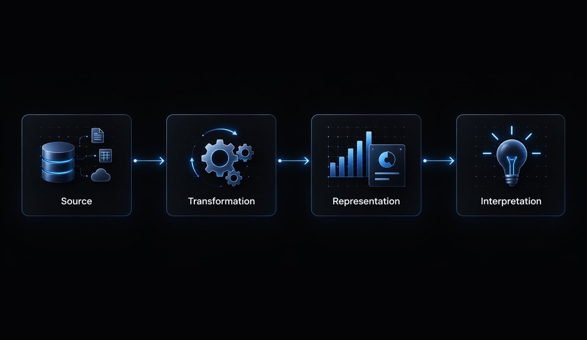
Data visualization validation is the process of checking that approved source data becomes correct calculations, honest visual representations, and defensible interpretations. It requires independently established expected answers, not just running code. The four layers below form a practical editorial framework for review, not an externally certified standard or a guarantee of accuracy.
Layer | What to check | Common error | Validation question |
|---|---|---|---|
Source | Approval, coverage, grain | Wrong export | Is this the intended dataset? |
Transformation | Formulas and grouping | Averaged rates | Can we reproduce the value? |
Representation | Scales and interactions | Exaggerated differences | Does appearance match magnitude? |
Interpretation | Claims and limitations | Unsupported causation | Does evidence support the message? |
Layer 1 - Validate the source
Data provenance means where data originated and which version was used. Confirm the approved file, table, or application programming interface (API), freshness, date coverage, units, and exclusions.
Check missing values, duplicates, and grain. Can each metric be tied to an approved source?
For this fixture, retain the four-row dataset and its cohort rules together.
Layer 2 - Validate the transformation
Aggregation means grouping or summarizing records. Check filters, joins, grouping, deduplication, denominators, and date boundaries using an independent spreadsheet or calculation.
January’s known-answer fixture gives:
- Campaign A: 10 ÷ 100 = 10%.
- Campaign B: 9 ÷ 10 = 90%.
- Unweighted average: (10% + 90%) ÷ 2 = 50%.
- Combined conversion: (10 + 9) ÷ (100 + 10) ≈ 17.3%.
February is 25 ÷ 110 ≈ 22.7%, approximately 5.5 percentage points higher using unrounded rates.
Summing pre-aggregated counts can be valid when groups do not overlap. Rates and distinct counts require different handling. Here, compatible cohort definitions make the combined calculation meaningful.
Layer 3 - Validate the representation
Check axes, units, labels, colors, tooltips, and supported screen sizes. Bar charts generally need zero baselines because length represents magnitude. Line charts may use narrower ranges when clearly labeled and contextually appropriate.
Use W3C’s WCAG 2.2 to guide keyboard access, focus visibility, contrast, and alternatives to color-only meaning. Provide an accessible table or meaningful text alternative.
A brief inspection does not establish WCAG conformance.
Layer 4 - Validate the interpretation
Review titles, annotations, summaries, and generated insights. The synthetic increase describes a difference; it does not establish campaign causation.
Disclose incomplete periods, missing data, small samples, and methodology limits. Comparing cohorts requires equivalent observation windows.
Final quality-control checklist
- Approve source and version.
- Independently verify selected displayed values.
- Document metrics and denominators.
- Test filters and date boundaries.
- Confirm missing/duplicate handling.
- Test loading, empty, error, and extreme states.
- Verify labels and units.
- Test supported screen sizes.
- Record accessibility checks.
- Substantiate interpretive claims.
- Review dependencies and sensitive-data handling.
- Record independent analytical review and named approval.
A second agent can assist data visualization validation, but cannot replace independent expected answers and accountable human review.
Is the result a prototype or a production-ready application?
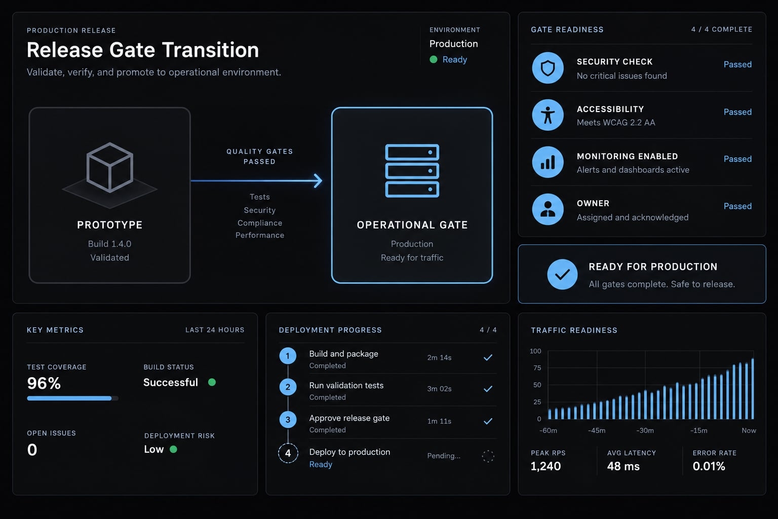
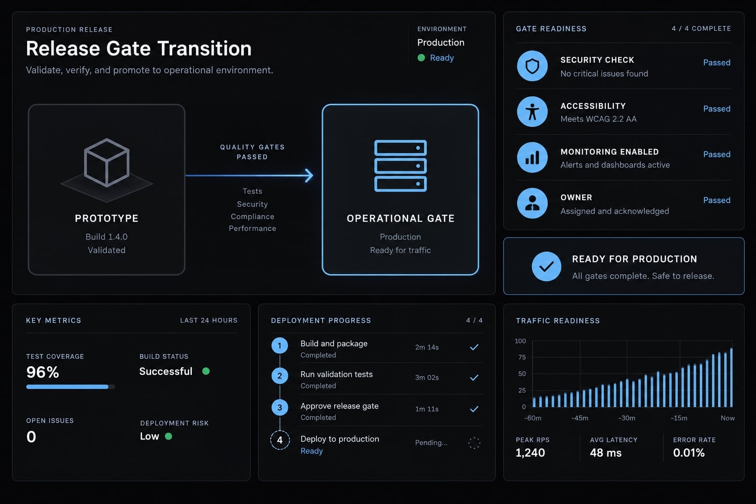
Production readiness means the application can operate reliably under its intended conditions, with accountable ownership and proportionate controls. The threshold depends on error consequences, data sensitivity, audience, access, integrations, and maintenance horizon.
Internal applications can carry serious risk. Public availability is not the only reason to require operational safeguards.
Prototype versus production comparison
Area | Operational application | |
|---|---|---|
Goal | Explore usefulness | Support repeated decisions |
Source controls | Approved snapshot | Controlled sources and changes |
Metric logic | Documented local formulas | Owned, consistent definitions |
Accuracy checks | Known-answer spot checks | Regression tests and review |
Error handling | Explicit limitations | Tested failure and recovery behavior |
Accessibility | Proportionate checks | Documented audience-appropriate assessment |
Security | Approved data and access | Least privilege and ongoing review |
Architecture | Limited, inspectable scope | Maintainable, reviewed structure |
Monitoring | Manual observation | Freshness and failure monitoring |
Maintenance | Named prototype owner | Supported updates and ownership |
Appropriate use | Bounded exploration | Approved operational decisions |
Software prototyping still requires security and responsible data handling. Running locally does not establish privacy: inspect model processing, telemetry, connectors, and network access.
A semantic layer, a shared place for approved metric definitions, is one governance option. Small applications may instead use centrally maintained calculation functions. Automated tests alone establish neither governance nor production readiness.
A coordinated agent workflow
Assign these responsibilities:
- Planner: defines scope and acceptance tests.
- Data profiler: identifies source issues.
- Builder: implements approved requirements.
- Test agent: executes configured checks.
- Visualization reviewer: checks representation.
- Code/security reviewer: examines implementation and access.
- Human owner: approves metrics and release.
These are responsibilities, not a requirement for seven separate agents.
AgentKit provides reusable skills and coordinated workflows for planning, implementation, testing, and review. Those capabilities organize work; they do not independently validate business metrics.
The example remains an illustrative design, not a tested application. An implemented version would initially merit prototype status until recorded checks and operational requirements justified another classification.
Frequently asked questions
What is vibe coding for data visualization?
Vibe coding is a natural language workflow where you use AI coding agents to generate dashboards and charts. You describe the desired visual output and data logic in plain language, while the AI agent handles the underlying frontend code, query construction, and layout implementation.
What are the main limitations of vibe coding visualizations?
The primary risk is the "plausibly wrong" output. AI agents can generate code that runs perfectly but produces misleading charts due to incorrect aggregations, improper baseline scales, or misaligned time intervals. Human editorial oversight and independent calculation are essential to ensure the visualization accurately represents the data.
How does vibe coding differ from traditional BI tools?
BI platforms provide governed reporting environments with reusable metric definitions. Vibe coding offers more flexibility for custom interactions and one-off questions, but the team must define, validate, and maintain metric logic itself.
Can non-technical users build production-ready dashboards?
Non-technical users can quickly prototype dashboards, but "production-ready" status requires more than just functional code. It necessitates operational controls, such as documented metric definitions, accessibility compliance, security protocols, and a clear maintenance plan to handle schema changes or dependency updates.
What is the 80–90% trap in vibe coding?
The 80–90% trap refers to the rapid initial progress—getting a basic dashboard functional in minutes—followed by a slow, complex final stage. Achieving pixel-perfect layouts, responsive design, and robust error handling often requires significant iterative effort, where AI agents may struggle to resolve conflicting technical constraints.
How do I ensure my vibe-coded dashboard is accurate?
Implement a four-layer validation framework: validate the source data provenance, verify the transformation logic through independent calculations (e.g., in a spreadsheet), confirm the visual representation correctly maps to the data, and ensure the interpretation is supported by evidence rather than assumptions.
What should I look for when selecting an AI coding agent for this task?
Look for agents that can inspect approved data files within controlled permissions, report schema and grain before coding, and show which checks they actually executed. Confirm where data is processed before connecting sensitive sources.
Read more:
- Mastering the vibe coding workflow: A practical delivery guide
- Spec-driven vibe coding: A smarter way to build with AI
- How to vibe code an AI agent: Build prototypes to production
Conclusion
Vibe coding for data visualization accelerates dashboard creation, but natural-language prompts should never replace analytical judgment. Trust comes from verifying displayed metrics against independent calculations and raw records - not from clean visuals alone. Use the provided planning prompt and validation checklist to define your scope, enforce data accuracy, and ensure every chart is backed by inspectable evidence before release.#