[VC-06] How to Vibe Code a Beautiful Interface?
This is a problem that seems simple but is quite “thorny” for many people. Today I’ll describe how I handle this problem, hoping it will help you and open up more approaches.
This is a problem that seems simple but is quite “thorny” for many people. Today I’ll describe how I handle this problem, hoping it will help you and open up more approaches.
Fundamentals
Everyone has probably prompted like this before:
“Create a beautiful website homepage”
“Not beautiful enough, make it more beautiful”
“You call this beautiful? AI is so stupid 😂”
Haha... first, you need to understand the core of the problem: AI has no aesthetic sense!
Some of you might think: “Then why does it generate beautiful images?”
I’ve mentioned this in previous articles - the essence of AI is “statistical probability based on algorithms.” It simply “learns by rote” patterns from many different artworks (that have been labeled and trained by people), then uses algorithms to mix everything together into the final output (based on keywords in the user’s prompt).
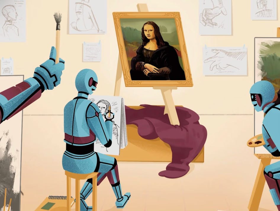
So where does aesthetic sense come from? -> HUMANS.
The problem here is that even for humans, aesthetic standards differ - what one person perceives as beautiful, another might see as ugly. Clearly, this is a thorny issue because it’s... as vague as a joke 😁
Therefore, to solve this problem, you need to create an interface design that not only you find beautiful, but also fits the crowd’s taste.
Ok, let’s get started!
Understanding Beauty (Necessary Condition)
First, let me tell you a fun story:
Have you noticed that when you were young (in elementary school, for example), the girls you “liked” looked really cute and lovely, but now that you’re grown up and thinking back (or looking back at them), you suddenly find... oh, they were just normal (why did I like them so much back then?)
This is simply because your “aesthetic standard” has changed. As you grew up, you began to see more beautiful people, or heard friends praise more beautiful people, or simply watched beauty pageants, so your brain adjusted to this “standard,” making those old standards (created by yourself) no longer suitable.
So to “create a product with a beautiful interface,” you need to bring your “aesthetic standard” closer to the crowd’s standard (market/taste).
You need to know:
How to distinguish what is called BEAUTIFUL
See many beautiful things in different styles
—
The principles of beauty
1. The first thing is to go see beautiful things yourself:
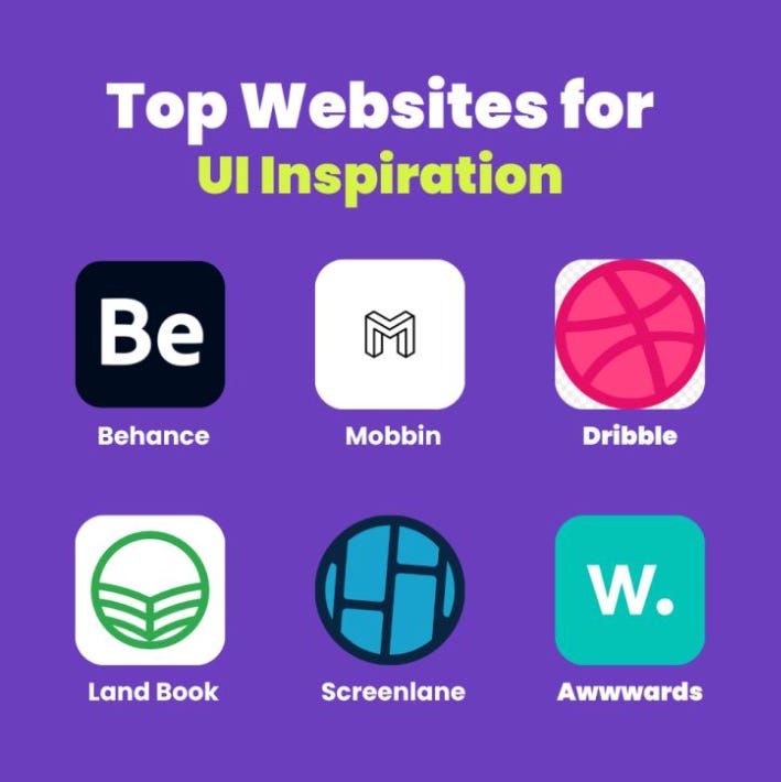
Go to Dribbble, Mobbin, Behance, Muzli,... sort by likes, then copy those images, paste them into ChatGPT, Gemini, or Claude and ask it to analyze:
What design style is this? (you’ll learn keywords like Memphis, Flat Design, Glassmorphism, Liquid Glass,...)
Your evaluation of this design (tell AI to “be honest”)
Essential elements to create similar designs (layout, typography, color styles,...)
This way, besides understanding current design trends, you’ll also learn more about crowd taste.
2. Layout:
“It’s ugly but its structure is beautiful” - has anyone heard this “compliment” before? 😂
In the art world, understanding layout is a prerequisite. Many designs aren’t very aesthetically beautiful, but having a harmonious layout makes viewers find them pleasing to the eye.
The exploration method is similar to step (1), but this time ask questions about layout:
What is this layout called?
What other types of layouts exist in design?
What are the names of layout types in mobile apps?
What types of layouts are there in web design?
When is <fill-in-name> layout typically used?
Keep repeating step (1) and (2) until you understand more about “the principles of beauty” 😁
“We don’t know what we don’t know” - Admit that if you’ve never done design, never drawn, or created art, you won’t know this knowledge. But through the above exploration methods, you’ll build specialized vocabulary and core knowledge related to design, thereby establishing a foundation to create BEAUTIFUL designs later.
Finally, choose a design style you like most, and continue with the following steps.
BEAUTIFUL is Not Enough, It Must Be RIGHT Too!
Beautiful but poor UX, improper layout, or unusable is also trash, so we need to continue learning about UX, Layout, and Design System.
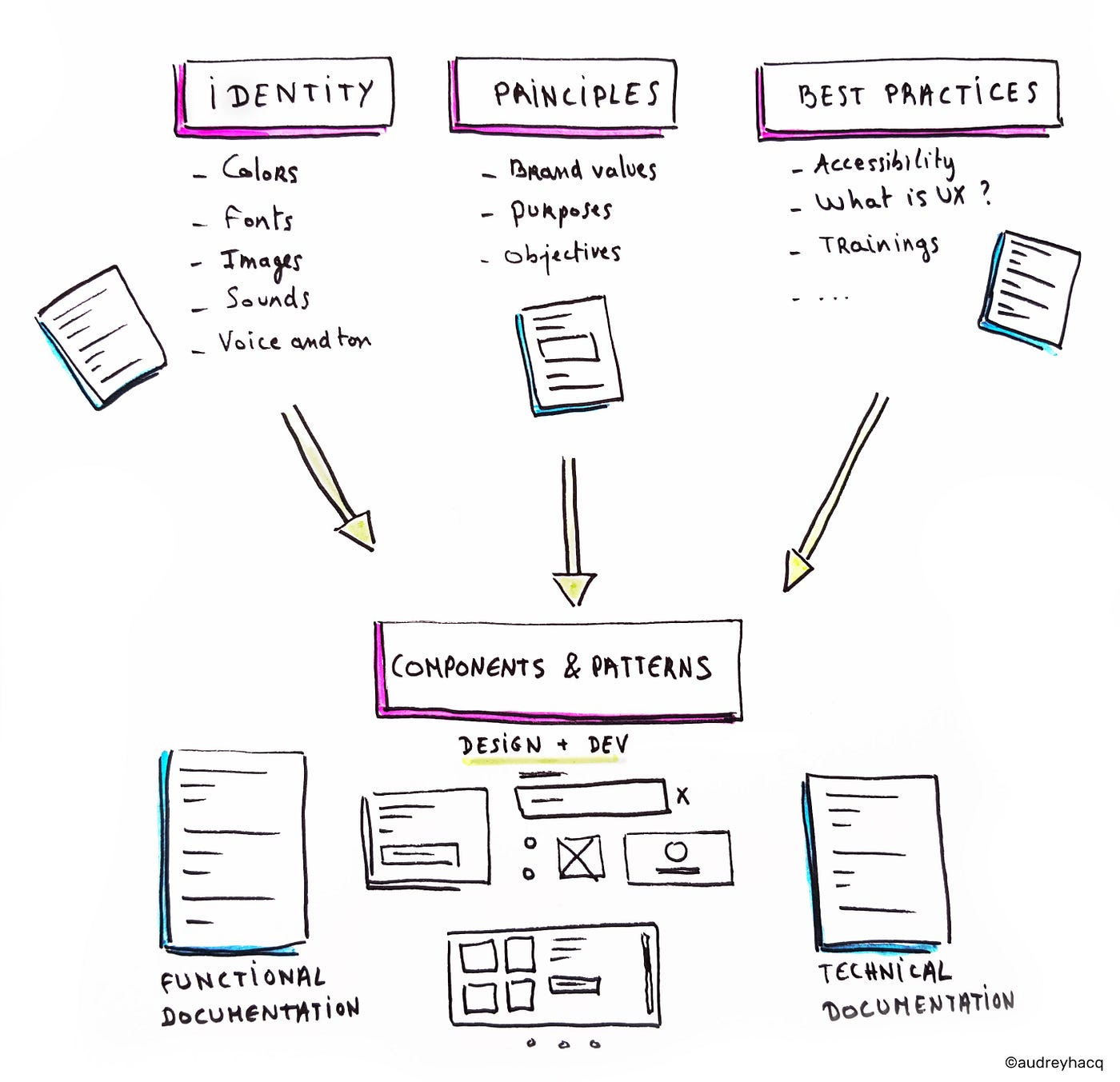
Still using the same method, search for keywords like “Figma Design System + <design style>” on Google, or use Gemini Pro Research.
Browse through to understand what a design system includes & their names (Typography, Calendar, Input, Form, Button,...), pay attention to what each component contains and how the layout is arranged.
Also like the previous section, take screenshots of designs you like and give them to Gemini (or ChatGPT, Claude) and ask it to analyze:
“What types of layouts does this design system use”
“Honest evaluation of this design system”
“Analyze and compare these 2 design systems”
“Evaluate UX and ways to improve this design system”
(This is learning while doing - if you delegate everything to AI, you won’t learn anything!)
Save your favorite Design Systems to your computer! We’ll use them later.
Pro Tip:Use AI to dig deeper and learn more about “Brand Guidelines” - in simple terms, each product/brand usually has its own characteristic design style, aimed at increasing recognition, like how everyone knows a green helmet means Grab.
BEAUTIFUL + RIGHT, Now: SATISFYING & PEAK
Who doesn’t like “fancy fancy” stuff? 😁

SATISFYING
This lies in the feeling, so just applying a bit of subtle micro-animations is enough to bring that “satisfying” feeling.
Animation & Interactions
This is where your taste shows:
Basic animations: fade, slide, scale
Sequence animations: Each element animates separately with 0.1s delay
Timing: ease-out for natural feeling, spring for bouncy effects
Suggestion: learn more about [easing types] in animation like EaseIn, EaseOut, EaseInOut, Elastic, Circ, Quart, Back,...
Sample Prompt:
“Add fade, scale, and slide animations with sequence timing,
duration 0.6s, ease-out, stagger delay 0.1s”
Additionally, you can visit 21st.dev to reference components, animations, or subtle and beautiful effects.
Pro Tip: PEAK
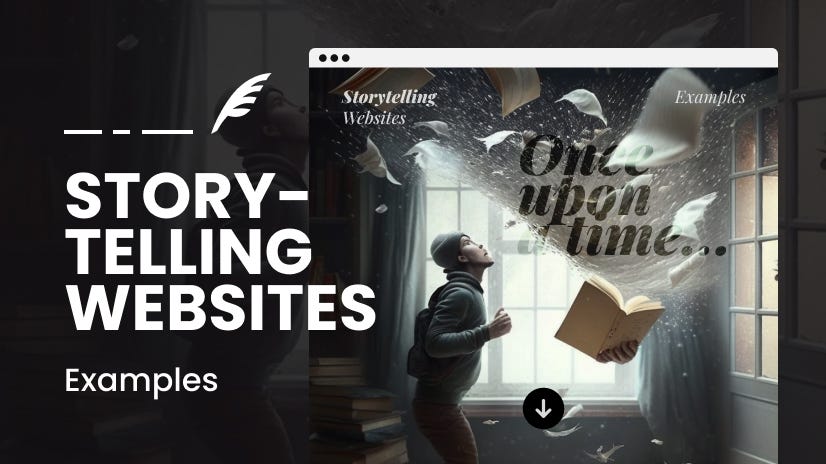
An interface that’s “BEAUTIFUL + RIGHT + SATISFYING” seems COMPLETE, but to reach PEAK level, you need to know how to TELL STORIES - “Story Telling” - breathing soul into design and experience.
A PEAK design will make your product look “outstanding” compared to the rest.
You can explore through the keyword “Parallax” and brainstorm with AI along with your product description, then ask AI to create a layout that tells a story about the product. Save this file in Markdown format and place it in the “./docs” folder in your project (”design-story.md” for example!)
Want to be even fancier? Learn more about these keywords: ThreeJS and Particle Effects
But try to exercise moderation - too much of anything isn’t good.
Experiment!
(Always Be Experimenting)
Method 1: Use popular AI tools like ChatGPT, Gemini, Claude,...
I use Gemini Pro web version to quickly create design templates using the Canvas feature.
You can also use Claude or ChatGPT, but from my experience, Gemini seems to have the best “Sense of Art.”
Don’t ask AI to generate an entire Design System, but start with small components you want in your application.
The purpose here is to quickly preview what the design actually looks like and create different variations for quick and convenient visual comparison.
In your prompt, mention all the elements you’ve learned from the this process above, for example:
Task: TODO App Interface
Design Style: Neobrutalism
Main Colors: Yellow, Blue, Green
Font: Variable (fonts with equal width for each character)
Design Story: Focus on Wibu Lover
Layout: Sidebar, left menu is for projects and main container to display list of tasks
Apply Micro Animations & Effects on hover, click,...
Show confetti effect when complete the tasks
—
Pro Tip 01:
If possible, sketch the interface on paper if you already have an idea in mind about what you want AI to create, take notes directly on the sketch, then take a photo and throw it straight to the AI tool - it will understand everything! 😁
Pro Tip 02:
Use tools like Lovable or V0! This method is exactly the same as above, so I won’t repeat it. Just try it out if you want.
Then, from the results AI creates, ask it to create many different variations so you have a more comprehensive view and can choose your favorite style.
Continue experimenting by asking AI to create a complete Design System from the component you want, mainly to see what other components look like.
When you’ve found your favorite design style, the final task is to prompt AI to describe in detail the entire style you chose and the standards of this Design System in Markdown format, so you can easily download it as a guideline for all design in your product.
Method 2: Leverage the Power of Claude Code’s Subagents This method is amazing :)) As introduced in previous posts, CC has a pretty awesome Subagents feature, and it also allows you to summon subagents to run in parallel.
Imagine this:
Create 3 agents corresponding to each different design style.
Prompt to CC:
Start a 3 parallel agents to implement variations of the to-do app UI Result: 3 agents will work in parallel:
Agent 1: Minimalist to-do UI
Agent 2: Modern to-do UI
Agent 3: Liquid Glass UI
So awesome!!!
Pro Tip: (a bit technical)
Learn more about Git Worktrees - allows checking out multiple branches simultaneously in separate directories - each worktree will be a different design style (e.g., nerdy, kid, gaming)
But wait, now leverage commands:
Extract Design System Command:
# Extract Design System
Analyze the provided UI image and extract:
- Color patterns
- Typography
- Layout principles
- Component styles
Save as design-system.json in prd folder
Usage:
If calling from outside Terminal:
claude ui/extract-design-system [image_path]
(attach an image grabbed from Dribbble/Mobbin 😂)If calling from within Claude Code:
/ui:extract-design-system @[image_path]
Iterate Design Command:
# Iterate Design
Spin up 3-5 sub-agents to implement same UI in different styles:
- Read design-system.json from prd folder
- Create variations in ui-iterations/ui1, ui2, ui3...
- Each should be single HTML file with inline CSS
Usage: This is to create many design variations -> Example:
claude ui/iterate-design “modern phone to-do app using extracted design style”MCP - MCP - MCP
Oh man... how can we skip this!
Have you noticed that all AI-generated interfaces look... similar?
One commonality of those interfaces is: NO IMAGES!
Luckily, we have appropriate MCP servers for this:
Chrome MCP
(or you can use Stagehand MCP, Playwright MCP or Puppeteer MCP too)
Directly ask AI agents to research design styles on the internet
Analyze designs from Dribbble or Mobbin
Even validate design during development (using MCP’s screenshot tool)
Figma MCP
This isn’t for designing, but for coding based on existing Figma designs.
However, it’s quite useful - the Figma community has many beautiful designs shared publicly, grabbing them and fine-tuning is not a bad idea hehe
(This isn’t official from Figma - the official one is Dev Mode MCP server, but I haven’t used it yet. If anyone has, please share!)
Freepik MCP
ChatGPT-Image MCP
Download Images with Bash Command
Or you can also install gallery-dl and ask CC to call this bash command to download related images when needed.
FINALLY: Package & Real-world Deployment
From the experimental version above, ask Gemini to create a markdown file to describe in detail this design style, or if using Claude Code, just ask it to analyze directly through HTML/CSS, from typography to colors, design standards, design highlights,... then put this Markdown file into the ./docs folder in your source code. Example: “./docs/design-guideline.md”
Then add Development Rules to CLAUDE.md to remind CC to read through these guideline files when implementing parts related to design and interface.
Or you can also create a command dedicated to handling UI tasks: /ui for example
Because commands are User Prompts, they have more “weight” than CLAUDE.md (System Prompt), so CC won’t be able to ignore these constraints:
# ui.md
---
description: Create a component based on the guideline
---
Read through `./docs/design-guideline.md` and `./docs/design-story.md`, then perform the following task: $ARGUMENTS
Remember to always experiment and customize to suit your own way of working. If you discover any better tips during this process, please share them with me!
That’s it - this is the entire process to create standardized & beautiful interface designs that I’ve implemented in most projects.
Wish you success! 🫶
Key Takeaways
The design process with AI that I created myself: “BEAUTIFUL + RIGHT + SATISFYING + PEAK”
Start simple, iterate: Don’t write 500-word prompts. Focus on 1 thing at a time. Always Be Experimenting.
My specialty: A bunch of “clever tricks” scattered throughout the article!